More Projects
branding
design
digital executions
IRD
IRD
branding
design
digital executions
IRD
IRD
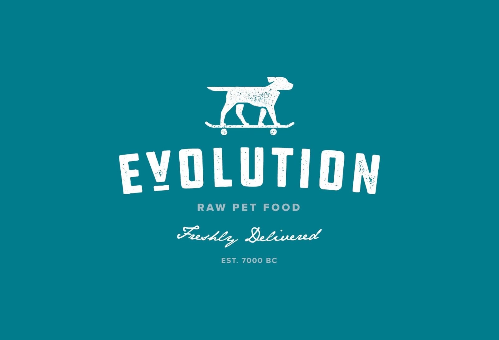
Evolution Raw Pet Food
Whole Food Love for Canine Hearts
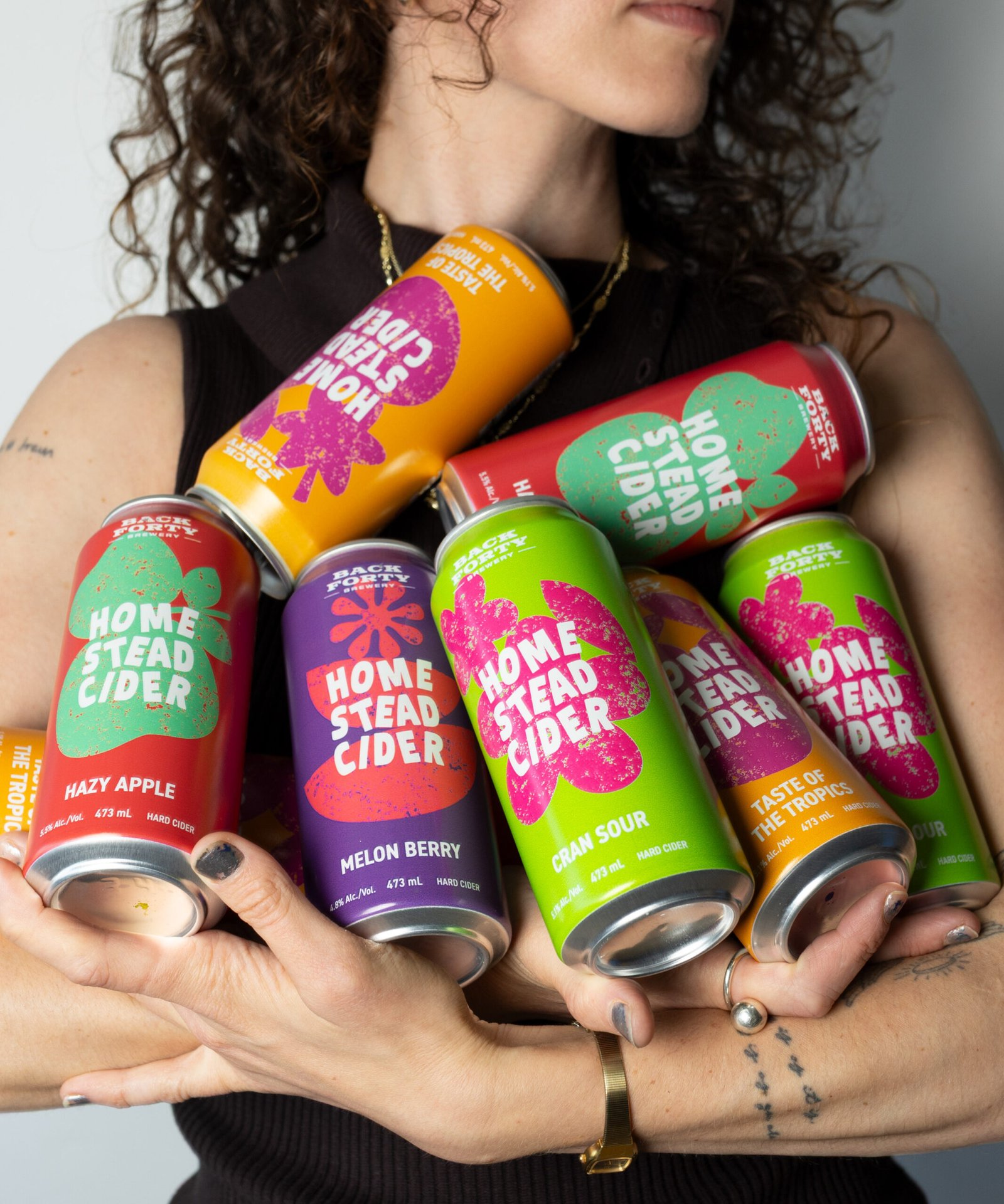
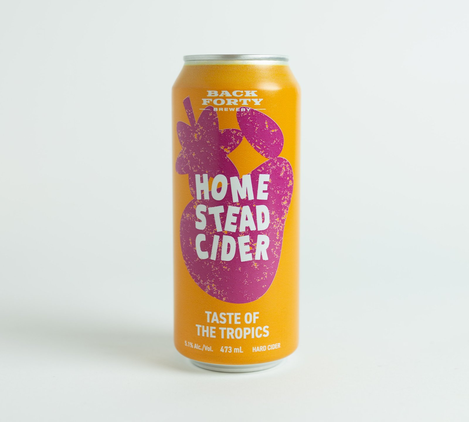
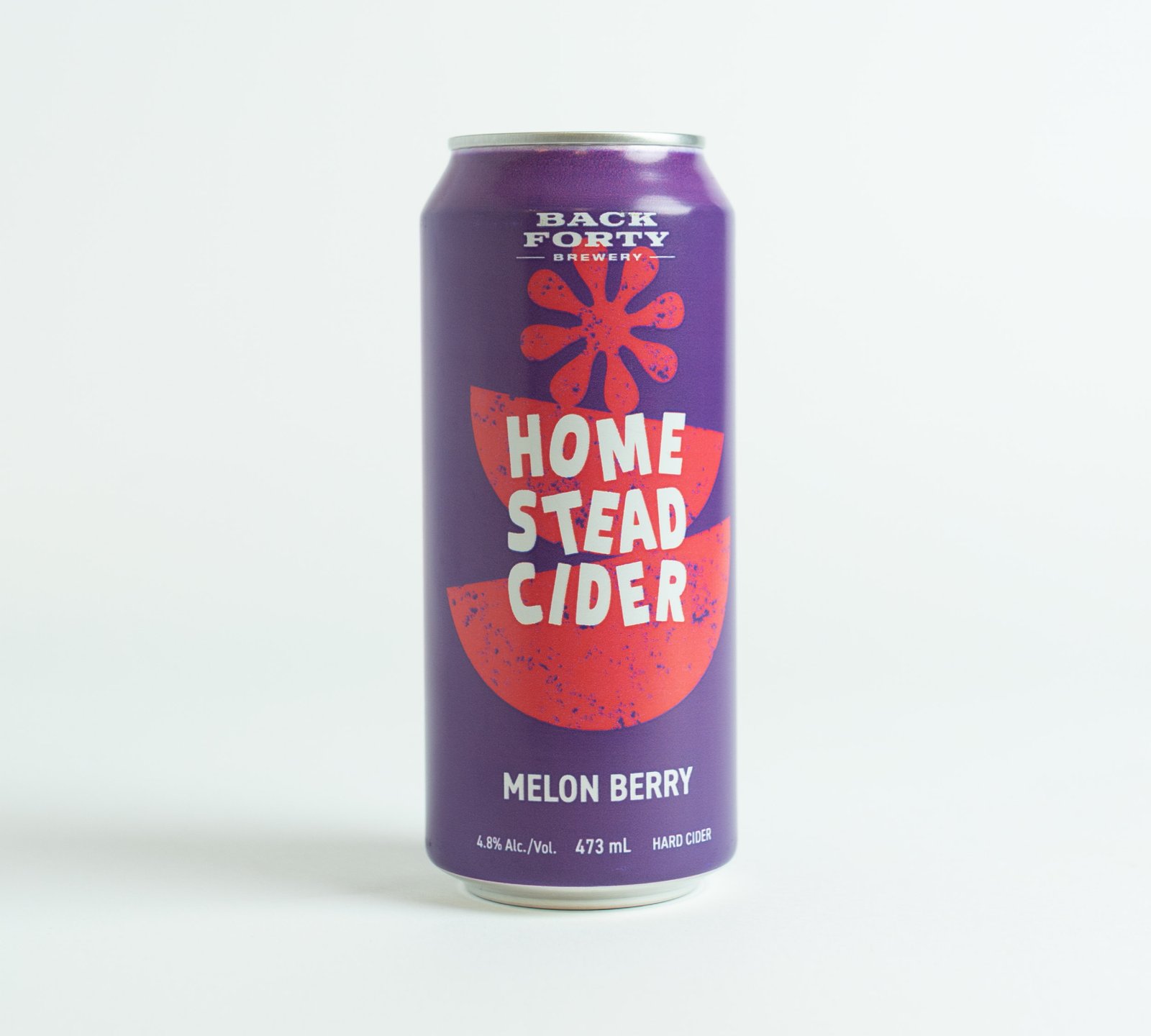
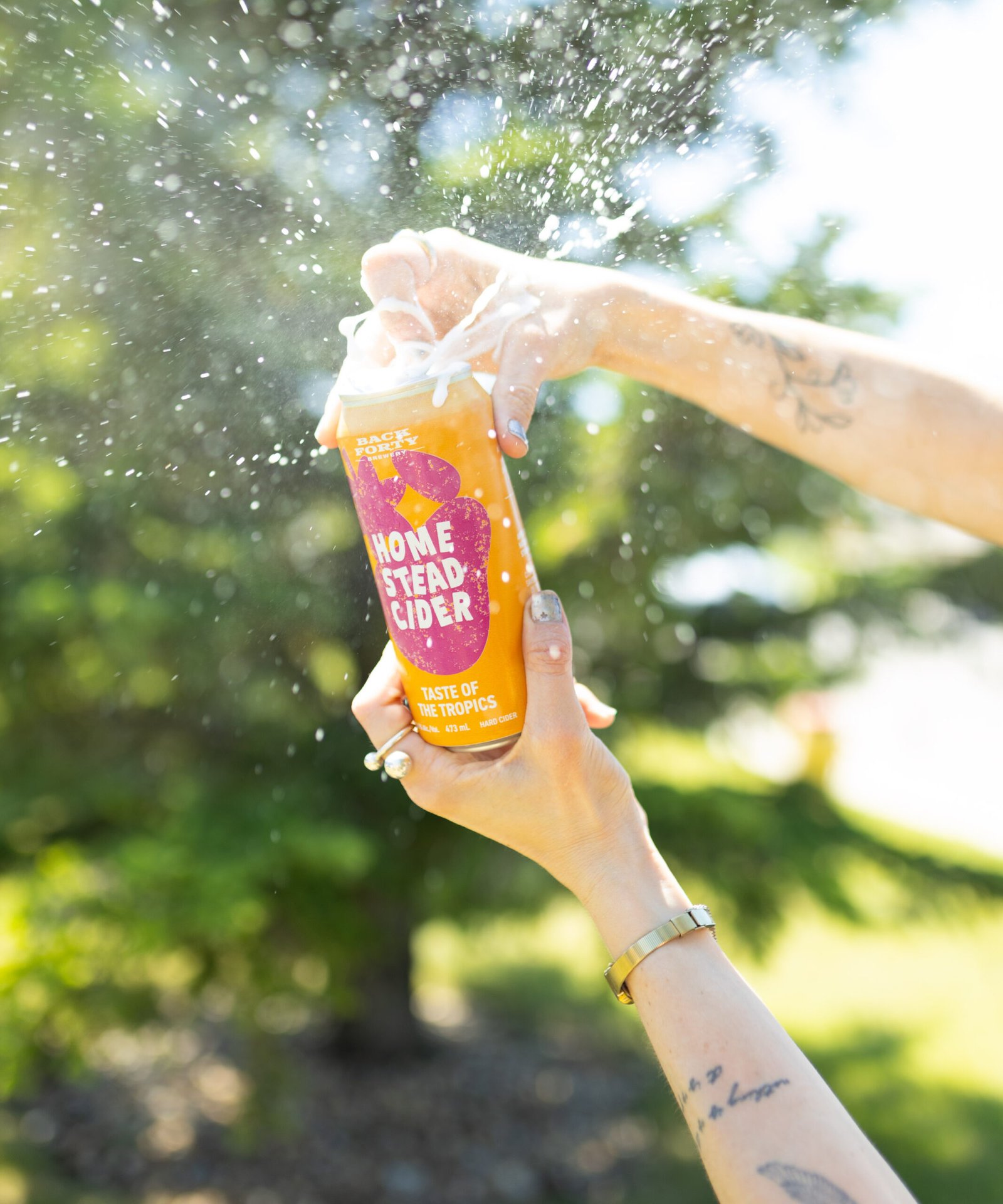
branding
design
packaging
Evolution Raw Pet Food
Whole Food Love for Canine Hearts
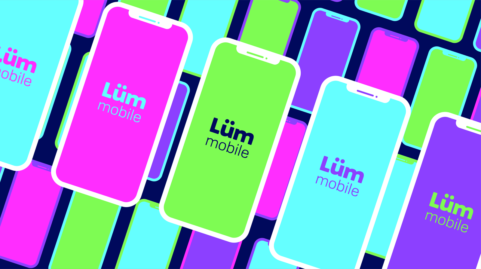
Lüm Mobile
Illuminating the Mobile Experience
design
digital executions
full campaigns
Lüm Mobile
Illuminating the Mobile Experience
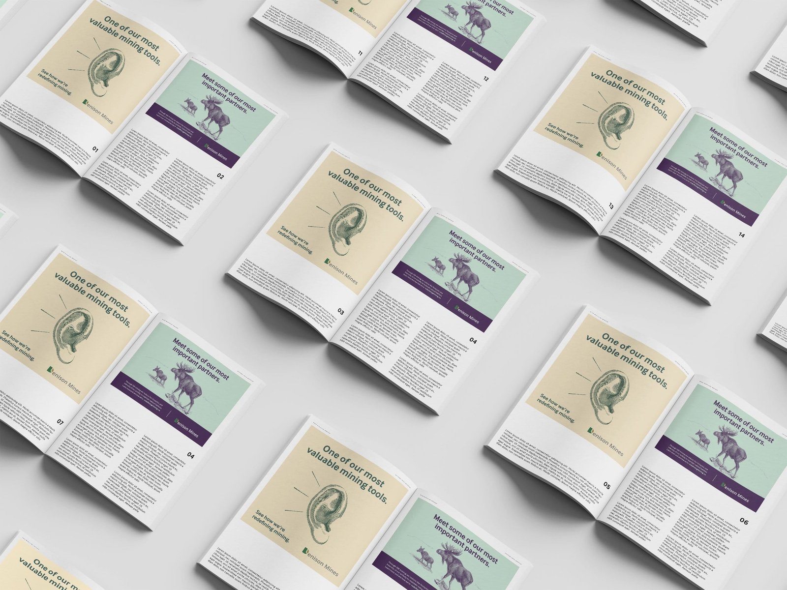
Denison Mines
Redefining Mining
branding
design
packaging
Denison Mines
Redefining Mining